Categories
Design Interface

You know, users can actually handle it

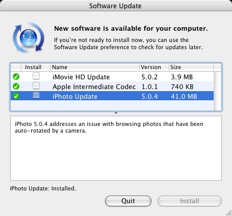
Apple is well known for steadily advancing UI design and opting for user friendliness over technical details. That reason alone is largely why I was once absolutely, unerringly pro-Mac to the bitter end. But there’s only so much I can take of the conveniently abstracted Apple Candylandâ„¢, and when Apple is too scared to scare users, the relationship is just awkward:

iPhoto Update - 41MB!

Honestly, whats wrong with a little more detail? 41MB for … a rotation fix? My left foot. I still love you Apple, but sometimes…

Categories
Design Interface Technical Visit This Site

A Picture Of Nectar

It’s just so endearingly cool when software from the open source side of the fence gets really cool like this.

When I returned from the Grand Canyon I setup the trip website gallery for everyone who wanted to contribute (the stuff nerds love to do). Having used Gallerybefore, I simply installed it again knowing it would work well for our needs. Later I found out about Coppermine, an even more feature-packed web gallery, designed for integration with phpBB or other forum software. I briefly considered moving the Gallery install over to Coppermine, but even though the install went great decided to KISS for my users.

Wow. I just installed Gallery 2 beta 3 on a whim, and it’s just day and night between Gallery 1 and 2. It’s DOS vs. Mac OS X, the differences are just that profound. They’ve moved over to a MySQL architecture instead of flat-files, and have improved the coding internals for more abstraction/extensibility. But since I’m an interface junkie, I appreciated the installer/administration/UI changes the most. Instead of navigating between ugly tabbed pages that smack of coder “design”, you get a very slick graphical, intuitive experience. Instead of throwing around various PHP technicalities and demanding server/Apache know-how from Joe Hapless, the installer finally takes care of everything it possibly can ala WordPress. Whereas Gallery 1 returns you to the “installer” pages when you want to change settings, 2 has a handy sidebar-driven interface that is much clearer.

My hat is off to you, Gallery 2 guys, excellent work on another polished LAMP offering.

Categories
Design Interface Technical Visit This Site

Tyger! Tyger! burning bright

In another excellent entry to his collection of Mac OS X commentary, John Siracusa today posted a review of Mac OS X Tiger 10.4. The most interesting part of the article was the description of the UI subsystem, Quartz.

I really appreciate a lot of things about Mac OS X. Well thought out enhancements to usability (Expose, working drag and drop, a hierarchical menu bar) have been among my favorites. However, Quartz has been a most egregious of offenders, so much so as to keep me from even using my old PowerBook for nearly a year. As someone who uses a computer every day, interface responsiveness is about as critical as it gets. OS X, unfortunately, has the slowest (most resource hungry) GUI of any operating system I’ve ever used. Even OS 9 was faster. Just try resizing a window and watch your CPU peg at 100%.

Siracusa nicely details (with pretty flowcharts) why OS X has suffered from what I’ll dub a molasses complex since Aqua was at Day 1. Regardless of how fast the actual hardware inside is, just using any G4 Mac felt slow [IMO]. The bandwidth of the data paths between hardware required to render things to screen (CPU, RAM, GPU) was being eaten faster than a fat kid at a candy store.

Fortunately, things have changed for the better. I have yet to use Tiger on the requisite hardware, but if the block diagrams Siracusa shows correspond to real-world UI speed gains, I’ll happily be back in the Apple camp once more.

That is, if Apple would nicely explain to me why my <1 year old iBook G4 can’t even support this and most of the other whiz-bang features Tiger brings to the table.
Categories
Handy Interface

Theming Windows XP

The user interface is the one thing you are going to see more of than anything else on your computer. Fortunately plenty of software titles allow you to switch between different themes.

Good news if you use XP. Microsoft’s theming engine is not limited to the lame “Luna” themes introduced with XP. You can get the benefit of using Windows’ internal theming engine without actually paying a dime.

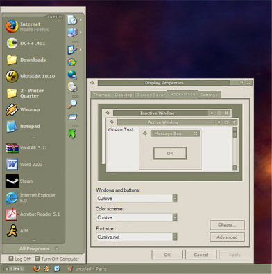
Cursive Screenshot

NOTE: This hack has worked for me through many Windows installs, but if you screw up your computer, I claim no responsibility.

The theme format for Windows XP has been very successfully reverse engineered. The three versions of Luna are all this format, and the themes for StyleXP also are in this format. Microsoft tried to limit the engine to only Microsoft themes, but we can patch the file that checks that.

Here’s what we’re going to do:

  • Patch uxtheme.dll so it accepts third party themes. Run this. You’ll probably have to restart.
  • Download this guy and open it.
  • Almost done! Now, copy the folder “Cursive” to “C:\Windows\Resources\Themes”. There should already be a Luna folder in here.
  • Go to the Display control panel, go to the Appearance tab, and select Cursive from the list, click OK, and you’re golden!
  • Hooray, StyleXP for free. Just move additional themes into the Themes folder to make them accessible through the Display control panel.

    P.S. Oh, and if you need to justify using themes to yourself beyond their cometic appeal, know that some themes like Cursive (below) can be functionally better. Thinner scrollbars, thinner titlebars, and a collapsed start menu translate to greater screen real-estate. As software gets more and more palette heavy, that can be quite handy.